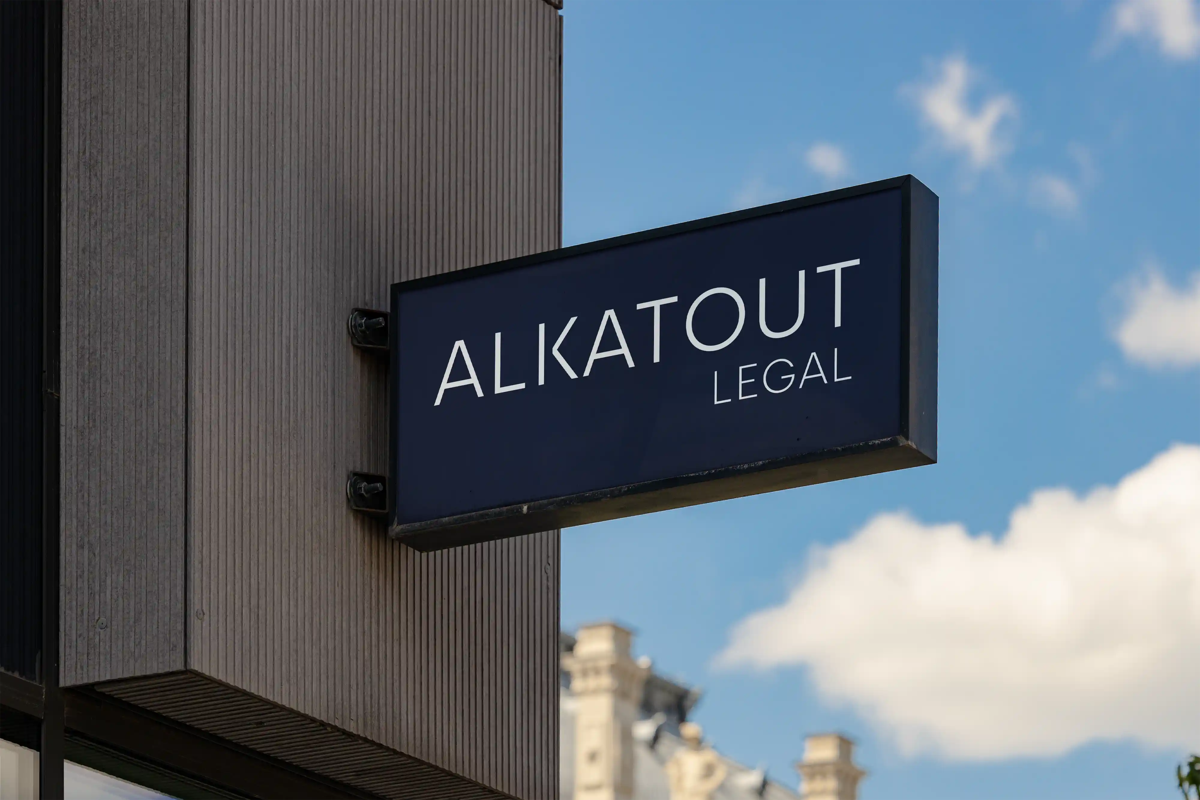
A CLEAR FOCUS. A BROAD HORIZON.
ALKATOUT Legal is a boutique law firm in Geneva that focuses exclusively on family law—with particular expertise in complex and international matters. Whether it’s cross-border divorce, international asset structures, or issues of custody and family law, the firm’s depth of expertise goes far beyond the traditional understanding of a family law firm.
For vierzehn02, the challenge was to translate precisely this vision into a distinctive firm brand.
Highly specialized, internationally connected, and personal.
THE CHALLENGE: MAKING SPECIALIZATION VISIBLE
Family law is a legal field that combines high technical demands with particularly personal issues. In international cases, different legal systems, languages, and cultural backgrounds come into play.
A law firm’s brand must therefore convey more than just legal expertise.
It must build trust, project confidence, and remain approachable at the same time. For ALKATOUT Legal, the goal was to create a visual identity that does justice to both the demanding international environment and the personal nature of family law cases.
No traditional law firm symbolism. No visual over-the-top presentation.
Rather, a brand that doesn’t have to assert its expertise—it simply exudes it.
THE BRAND: SIMPLICITY WITH CHARACTER
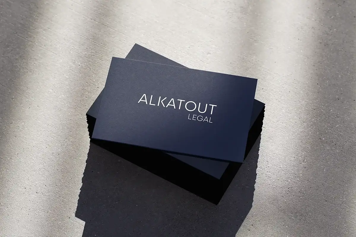
The ALKATOUT LEGAL word mark is at the heart of the corporate design.
Clear letterforms, generous spacing, and a deliberately understated design give the logo a timeless, international look. The firm’s name takes center stage, while the “LEGAL” suffix is subtly subordinated.
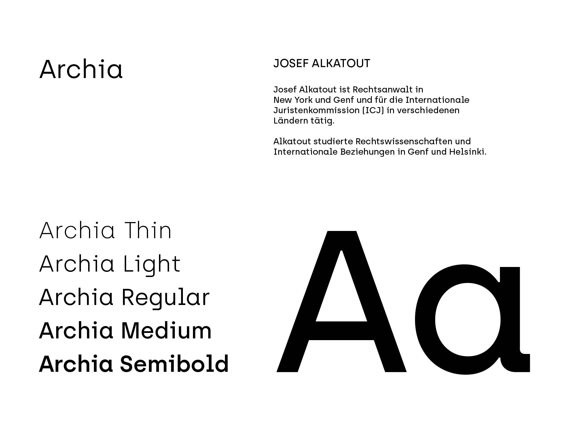
The typography also follows this concept. The Archia typeface family gives the brand a modern, precise typeface that appears both high-quality and approachable.
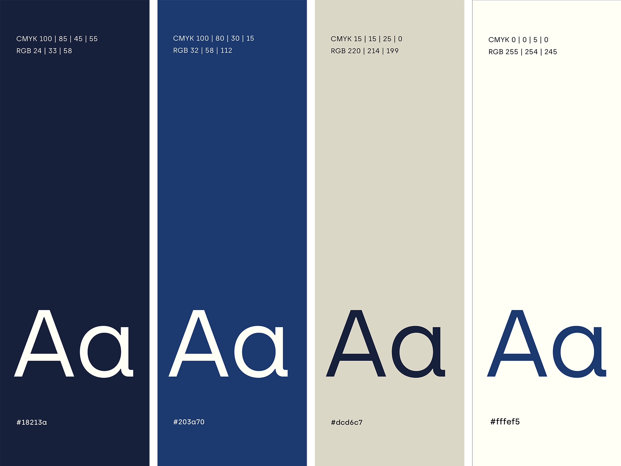
The color palette combines deep navy blue and a bolder blue with warm, light natural tones. This creates a visual identity that conveys professionalism and stability without appearing cold or distant.
The balance between clarity and warmth is particularly crucial: ALKATOUT Legal provides counsel in a highly sensitive area of law, often in situations with far-reaching personal and financial consequences.
CORPORATE DESIGN WITH INTERNATIONAL STANDARDS
An international focus doesn't have to be conveyed through world maps, flags, or other symbols.
For ALKATOUT Legal, it stems from a visual language that transcends national and linguistic boundaries: minimalist, elegant, and consistent.
The design system relies on clear proportions, precise typography, and the strategic use of color and white space.
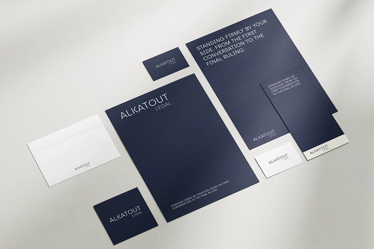
This approach is also evident in the firm’s stationery. Dark backgrounds with a light wordmark, high-quality paper textures, and subtle finishes underscore the firm’s character without drawing undue attention to themselves.
The result is a corporate design that is not tied to fleeting trends and derives its distinctiveness precisely from its understated nature.
THE RESULT: A BRAND THAT KNOWS ITS FOCUS
ALKATOUT Legal combines two characteristics that, at first glance, seem contradictory: a very narrow area of expertise and a distinctly international perspective.
The new branding brings these two elements together.
It positions the firm as a highly specialized entity, creates a professional, recognizable image, and provides the personalized advice with an appropriate visual identity.
For us, this project illustrates what matters most in branding for boutique law firms:
It’s not about communicating as many areas of expertise as possible. It’s about making the most important ones visible.
After all, a strong law firm brand doesn’t have to be everything.
It must unmistakably be the right one.
STILL IN THE RACE?
Mariam Purtseladze
Project Manager

We’ll figure out if we’re a good fit during our conversation. vierzehn02 develops corporate websites—from positioning and concept development to UX/UI design and technical implementation.
And yes: We ask quite a few questions at the beginning.

Not what you're looking for?
-
 view
moreBrand Strategy
-
 view
moreNaming & Claim
-
 view
moreCorporate Design
