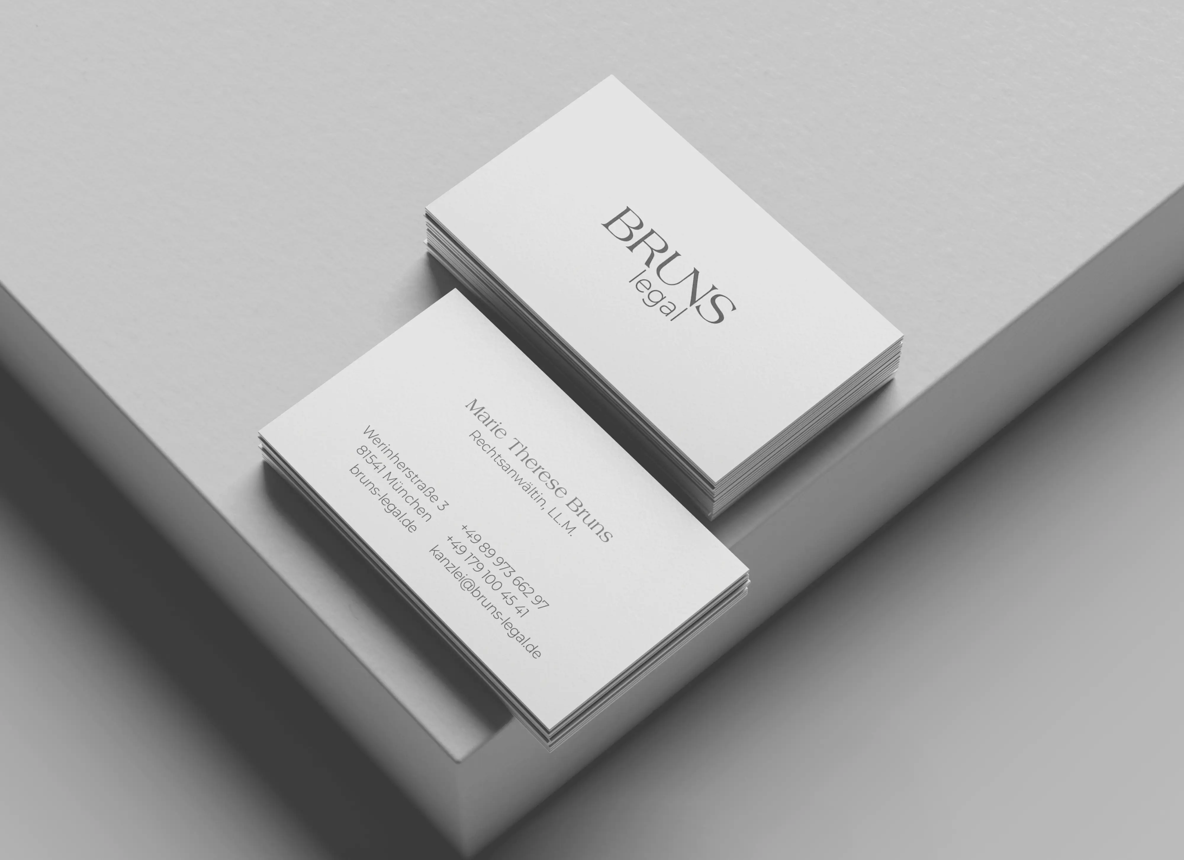
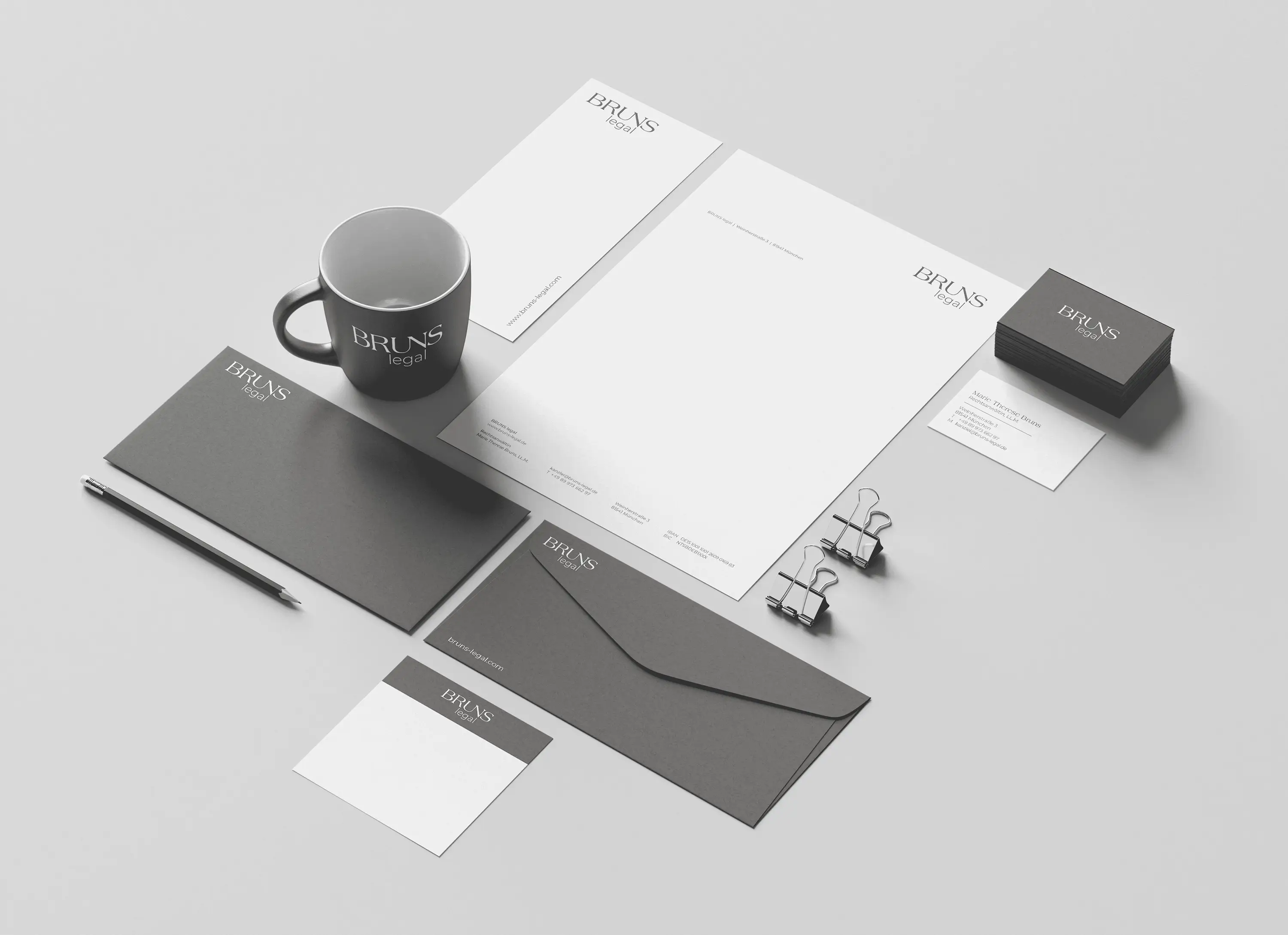
The starting point wasn’t design, but the question:
How does this law firm actually operate?
Not in the abstract, but in concrete terms.
The answer to that question became the foundation for the entire branding.
No visual embellishment. No staged “law firm world.”
Instead, a visual identity that consistently takes a back seat—and works precisely because of that.
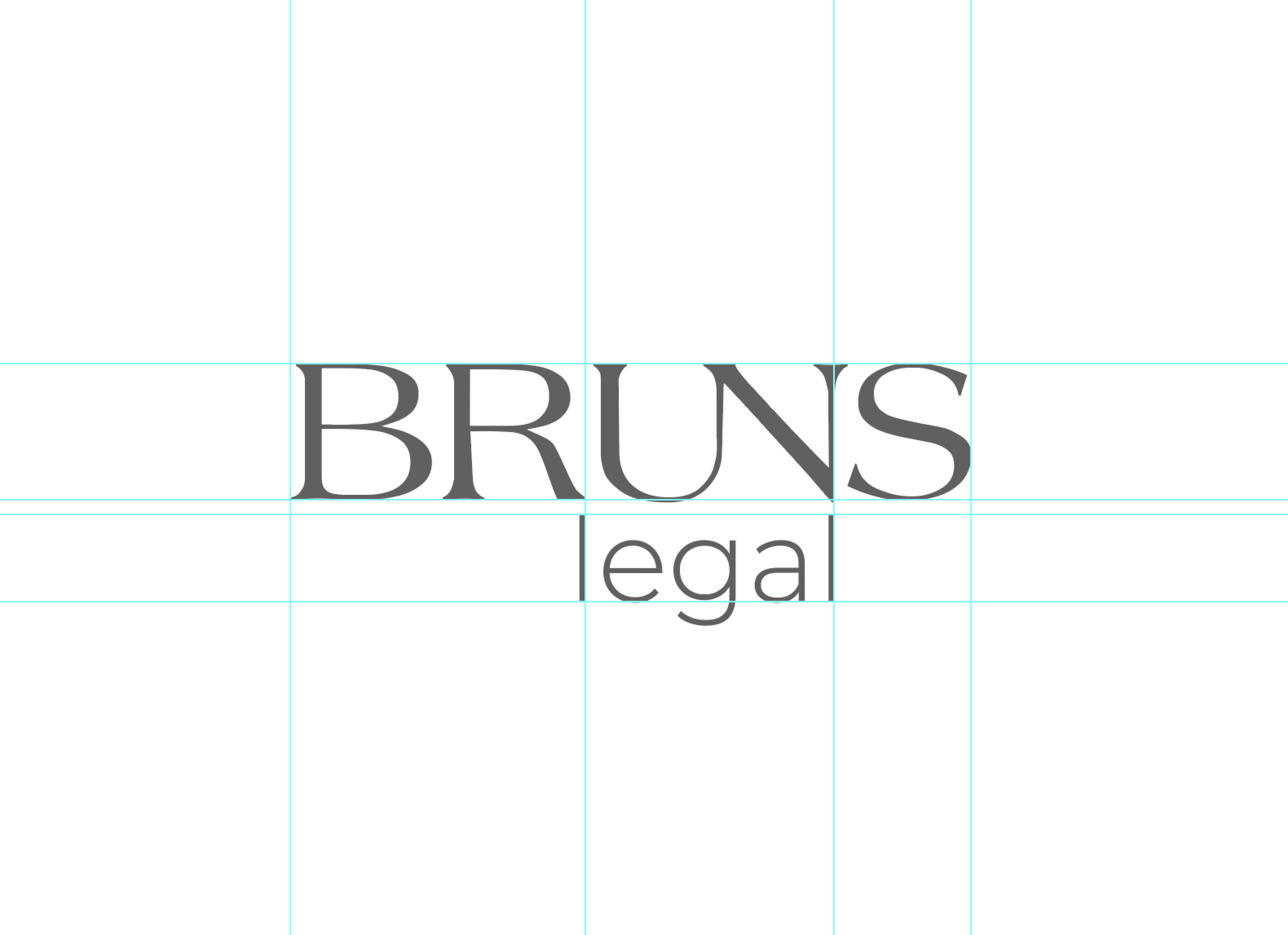
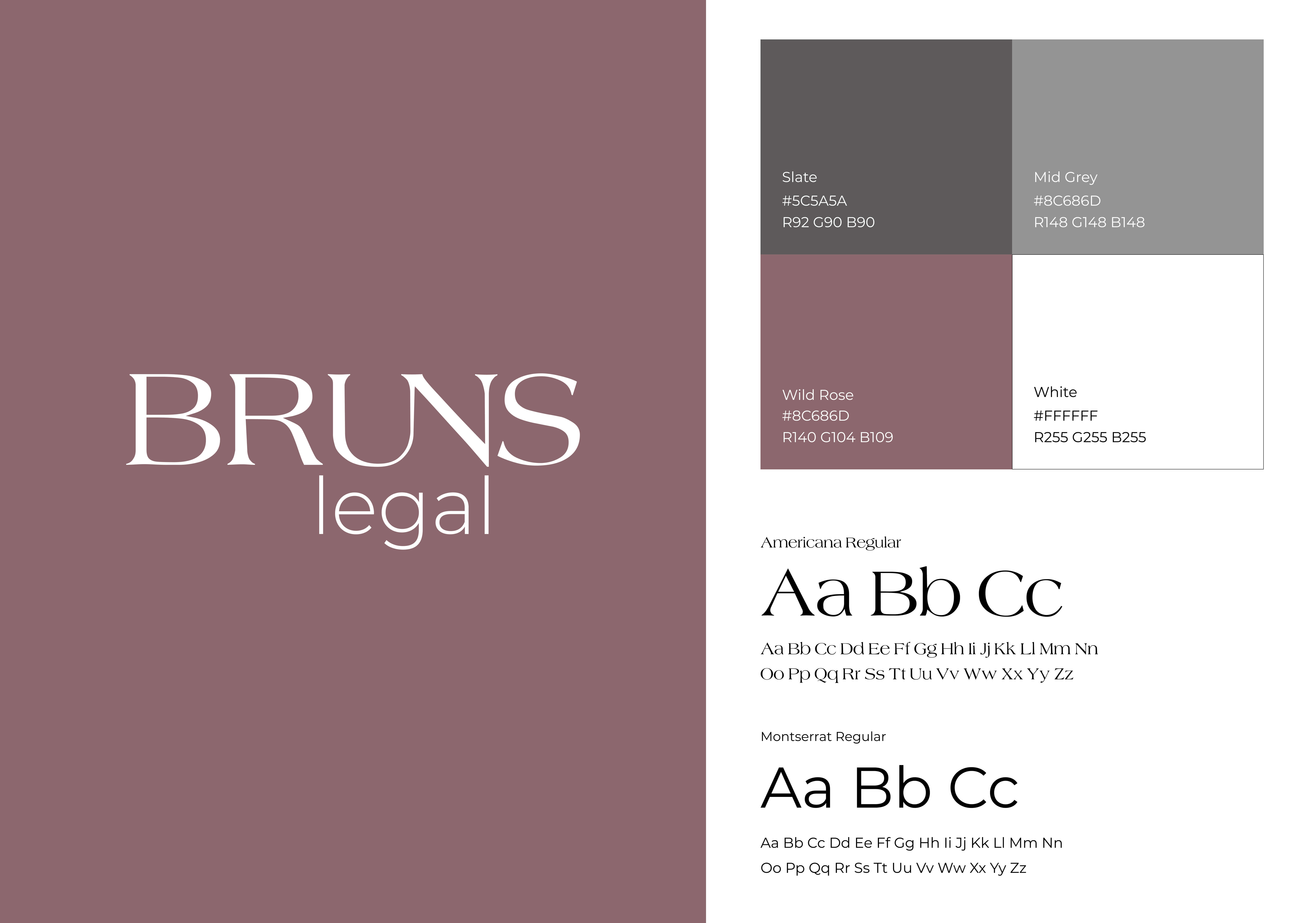
Typography plays a central role here. With Americana as the serif font and Montserrat as the sans-serif, a clear system emerges: calm in appearance, precise in execution. No gimmicks, just a structure that holds everything together.
The color palette deliberately avoids classic law firm clichés.
A subdued gray forms the base, complemented by a muted shade of pink that adds distinction without being overpowering.
This approach is most evident in the visual elements.
No hands, no suits, no staged conversations.
Instead, spaces, lines, perspectives.
Images that don’t merely illustrate, but point the way.
A passageway. A clear path. A destination that comes into view.
This isn’t a metaphor.
It’s exactly what clients in labor law are looking for.