The Challenge
Most law firm websites specializing in employment law are cluttered.
Too much text. Too many topics. Not enough guidance.
For clients, this means they have to figure things out on their own.
In employment law, that sends exactly the wrong message.
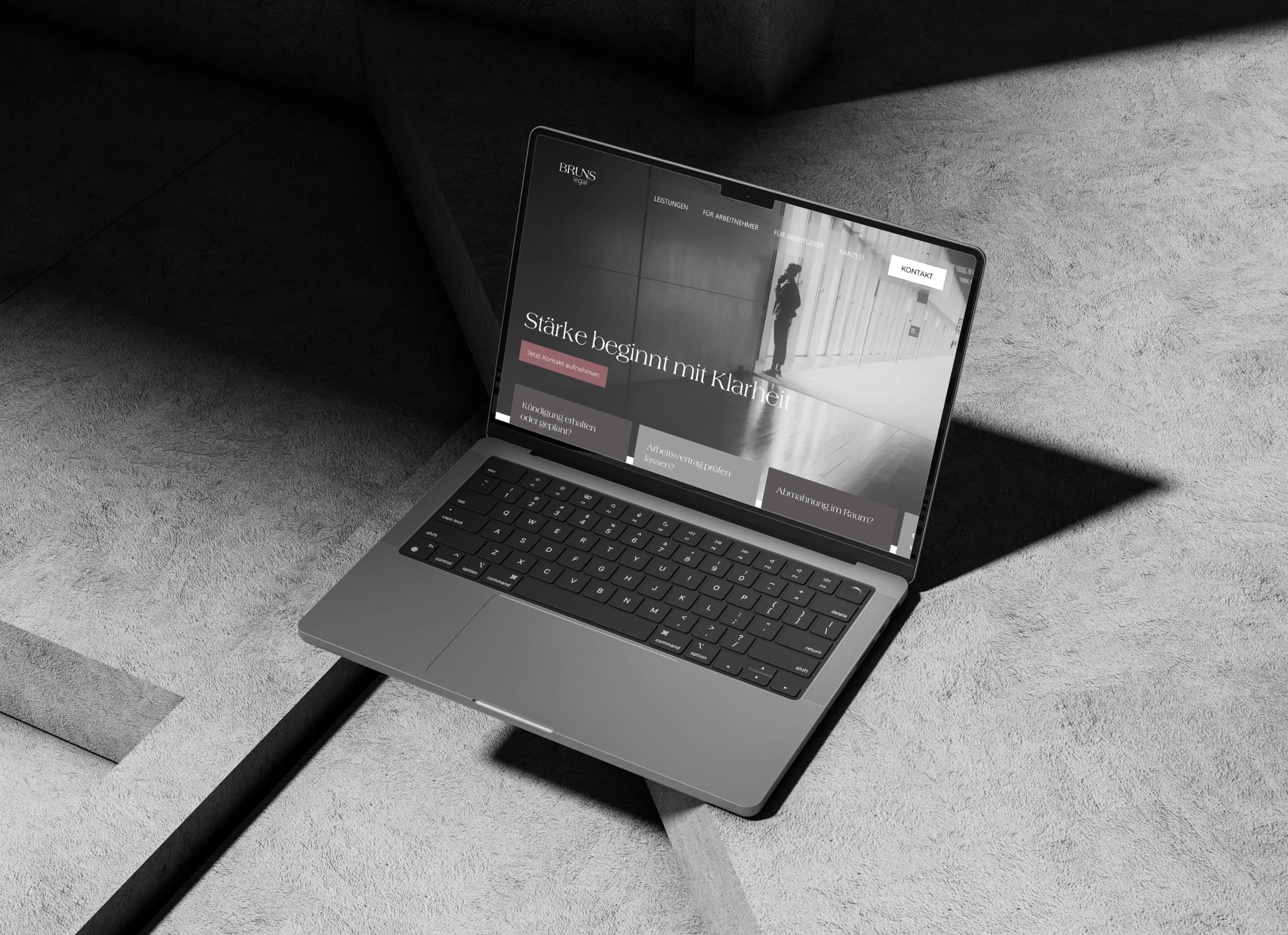
The task was to develop a website for an employment law firm in Munich that doesn’t try to explain as much as possible, but rather helps users quickly find their way. A site that provides structure instead of overwhelming visitors.
The Approach of the Agency vierzehn02
The website was not designed as a traditional information platform, but rather as a clear, guided system.
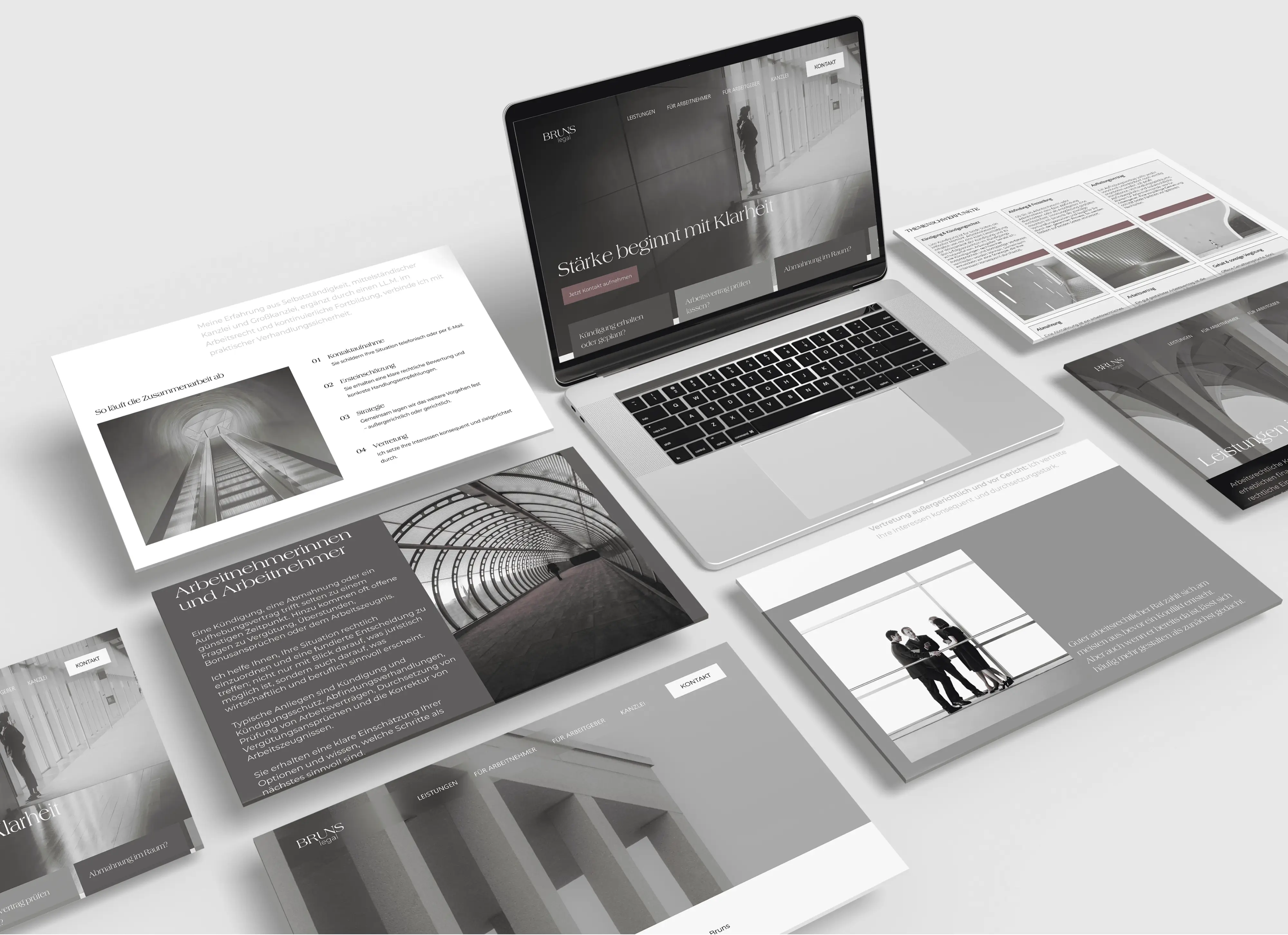
At its core is a streamlined content structure based on real-world questions. Users navigate not by legal categories, but by their specific situation.
The UX of the law firm’s website follows a simple logic: recognize, understand, act. Content is structured so that it can be grasped quickly and leads directly to the next step.
Visually, too, the website remains consistent.
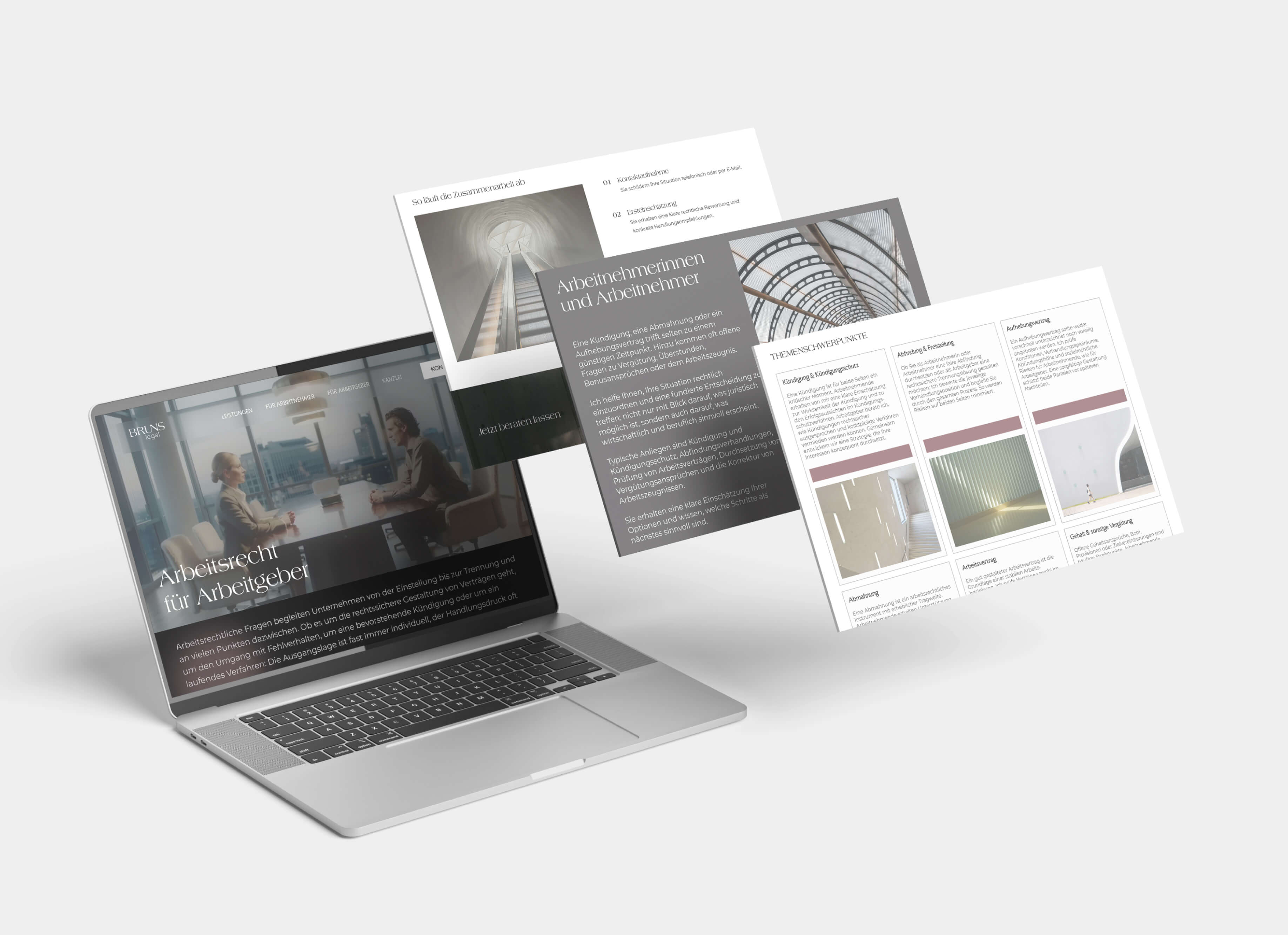
The corporate design developed is precisely translated into the digital application through the UI design.
The typography creates a clear hierarchy and guides users smoothly through the content. Serif elements add subtle accents, while the sans-serif typeface ensures structure and readability.
The color palette remains minimal and supports navigation rather than demanding attention. Gray serves as the base, complemented by subtle color accents that provide structure.
The imagery avoids illustrative law firm motifs and instead uses architectural perspectives. Lines, spaces, and visual axes create visual guidance—without coming across as explanatory.
The website deliberately uses white space and clear spacing—
not as a design element, but as a means of structuring the content.
Technically, the site was built using WordPress—a streamlined, high-performance system that consistently maintains the clear structure even in the backend and enables easy content management.
The result
The BRUNS legal website relies not on quantity, but on clarity.
Content is easily accessible and logically organized.
The structure guides users through the site without being intrusive.
The design remains understated and precise.
The result is a UX- and UI-optimized WordPress website for a labor law firm in Munich that doesn’t claim to inspire trust—it builds it.
Not a site that says everything—
but one that says the right things.
After all, anyone seeking guidance in employment law doesn’t choose the loudest website—
they choose the clearest one.
Can I help you?

Have we piqued your interest, or do you have any questions for us?
Feel free to send us an email with your inquiry.

Not what you're looking for?
-
 view
moreWeb Design
-
 view
moreOnline Marketing
-
 view
moreCorporate Design
