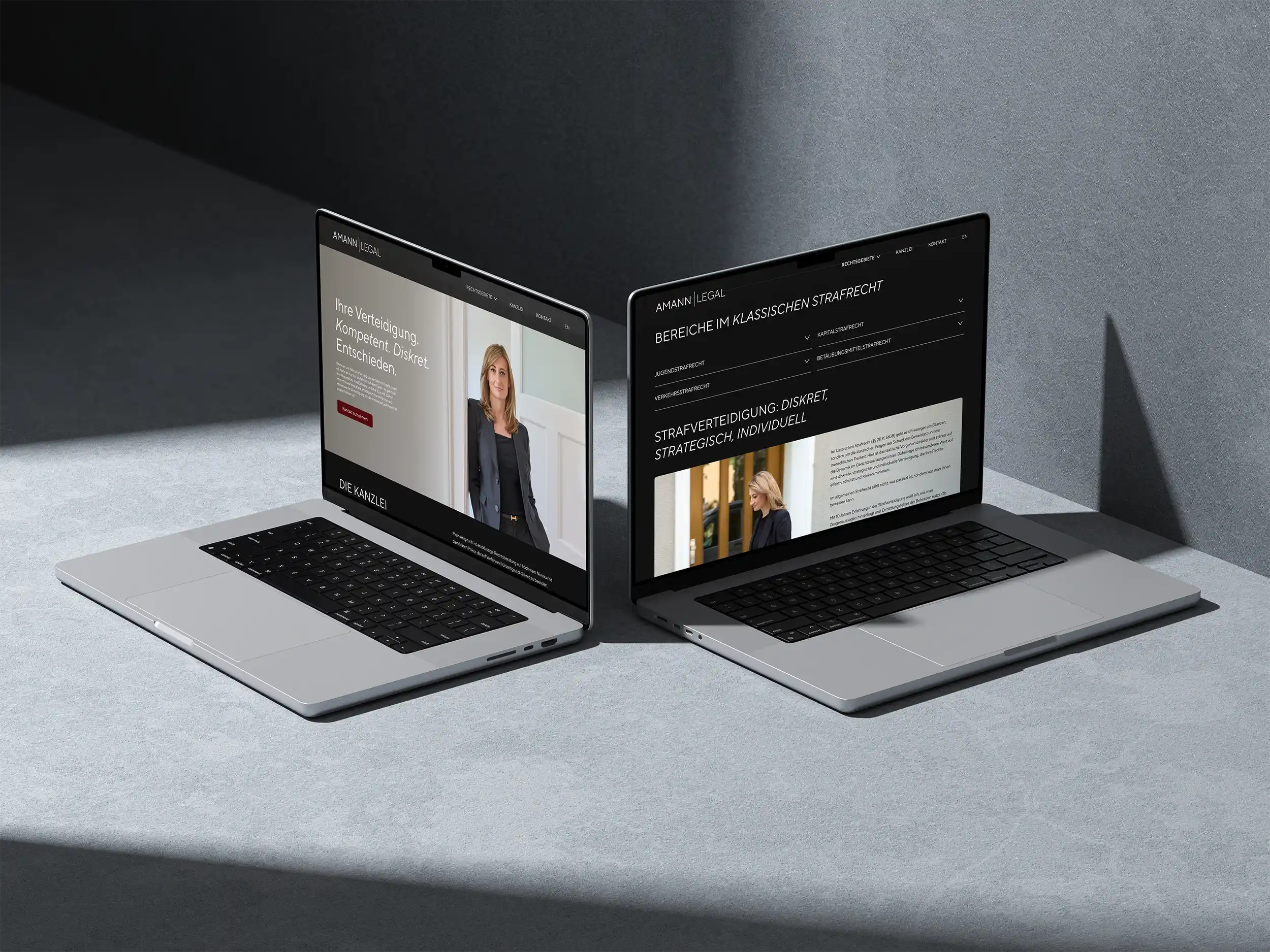
The Challenge
The visual communication of criminal law firms often takes place within a very traditional setting: courtrooms, Lady Justice, legal symbols, or an overall imagery strongly influenced by the legal world.
For AMANN LEGAL, the goal was to consciously take a different approach.
The corporate design was intended to convey competence, clarity, and assertiveness, while still appearing calm, modern, and distinctive—personal enough for an owner-managed firm, yet professional and confident.
Above all, the brand identity was intended to convey the firm’s approach: acting strategically, taking control early on, and providing guidance even in critical situations.
The task, therefore, was to develop a law firm brand that visually translates this approach—minimalist, precise, and consistent across all applications.
The Approach of the Agency vierzehn02
The starting point for the design was AMANN LEGAL’s approach: clear, strategic, and confident.
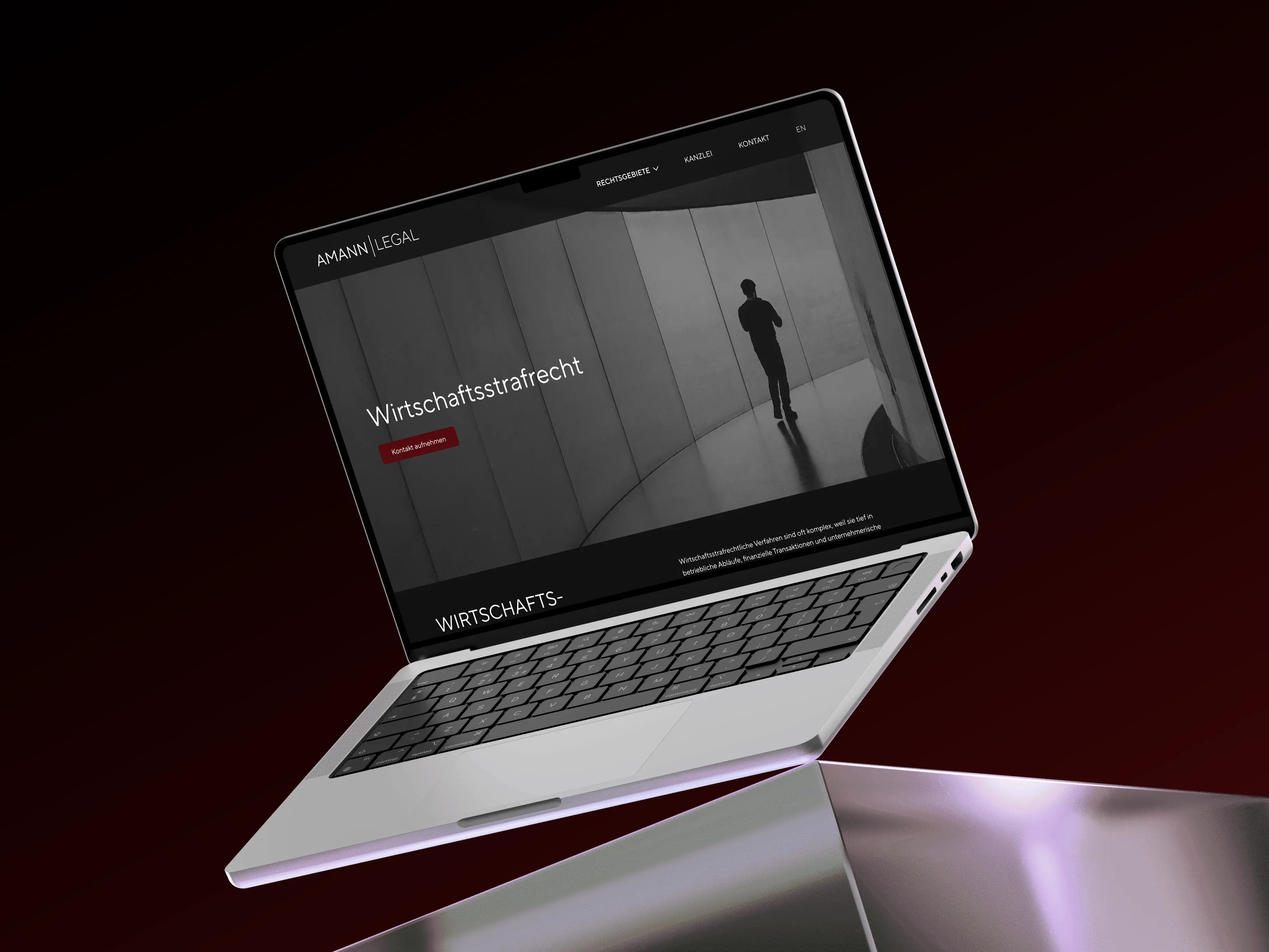
This gave rise to a deliberately minimalist corporate design that does not rely on typical symbols from the legal world, but instead develops a distinct identity through typography, color, and visual language.
The focus is on the word mark AMANN | LEGAL. The name becomes the central brand element; the vertical line structures the word mark and gives it a precise, modern look.
TT Norms Pro is used as the corporate typeface. The clean, geometric sans-serif font reinforces the minimalist character of the brand and works equally well in branding, on business stationery, and in digital communications.

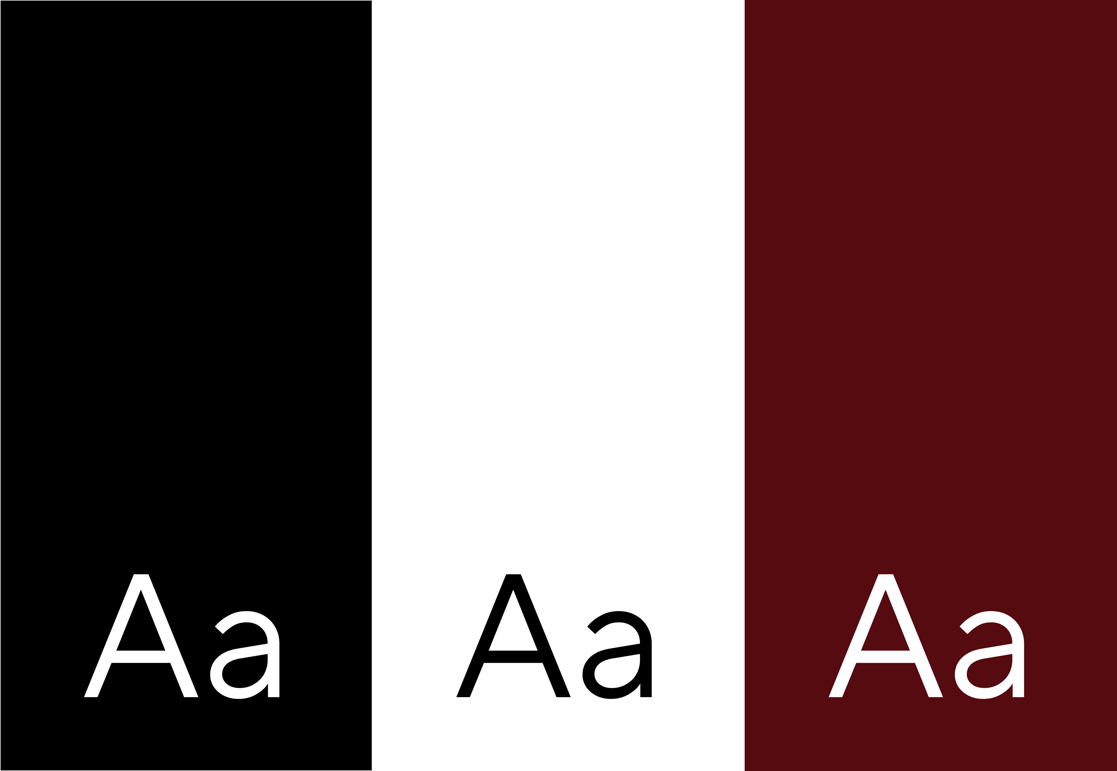
A MINIMALIST YET DISTINCTIVE COLOR PALETTE
The color palette was also deliberately kept minimal.
White and black form the clear foundation of the visual identity. They are complemented by a very light, warm shade of rose/beige and a rich terracotta or copper tone.
It is precisely this warm accent that gives AMANN LEGAL its own visual signature. It stands out clearly from classic, often very cool law firm colors without losing any of its professionalism.
The result is a color palette that appears precise, high-quality, and personal all at once.
CORPORATE DESIGN THAT GOES BEYOND THE LOGO
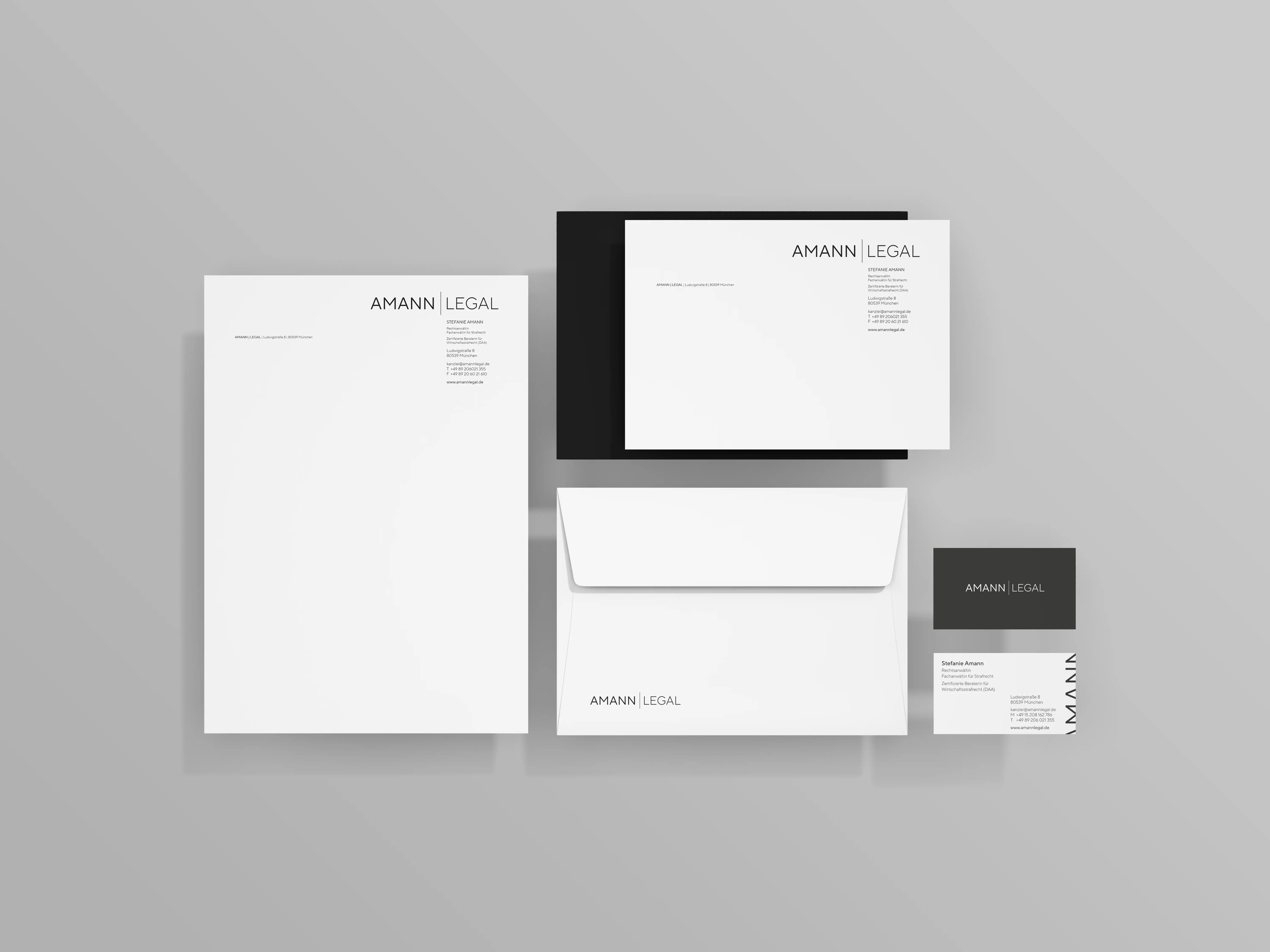
Based on this, a compact design system was developed for the law firm.
In addition to the logo, typography, and color palette, various corporate identity elements were created—including business cards, letterhead, a law firm sign, and notepads.
The goal was not to redesign individual media elements from scratch each time. What mattered most was a recognizable system that could be consistently applied across all touchpoints.
The minimalist design, in particular, demands precision: typography, spacing, color blocks, and proportions play a significant role in the brand’s impact.
THE VISUAL LANGUAGE OF AMANN LEGAL
THE RESULT
The result is a brand identity that deliberately avoids striking criminal law symbolism.
AMANN LEGAL presents itself as clear, modern, and confident. The minimalist wordmark, TT Norms Pro, the warm accent color, and the architecturally inspired visual language are seamlessly integrated.
From the firm’s sign to business cards to photography, this creates a cohesive visual identity that reflects the firm’s ethos: clear in strategy, confident in demeanor, and focused on results.
Can I help you?

Have we piqued your interest, or do you have any questions for us?
Feel free to send us an email with your inquiry.

